Top 5 Tips for Styling Published Layers and Maps
January 21, 2025 2025-01-21 9:00Top 5 Tips for Styling Published Layers and Maps
Top 5 Tips for Styling Published Layers and Maps
Styling layers and maps can go beyond the default settings to create clearer, more intuitive designs. These quick tips will help you enhance your maps using tools in ArcGIS Pro and Online.
Tip 1: Handle Overlapping Features with Clear Design
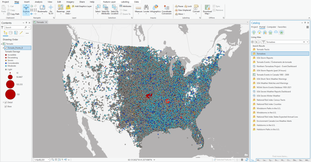
Overlapping point data, like tornado records from 1950–2022, can make patterns hard to see. Use size and color to prioritize information, with smaller symbols for lower classes and larger, vibrant symbols for higher classes. Adding transparency to symbols can help distinguish overlapping features. Finally, use the Feature Display Order to display significant data on top, creating a clearer story for viewers.
Tip 2: Use Custom Symbols in ArcGIS Online
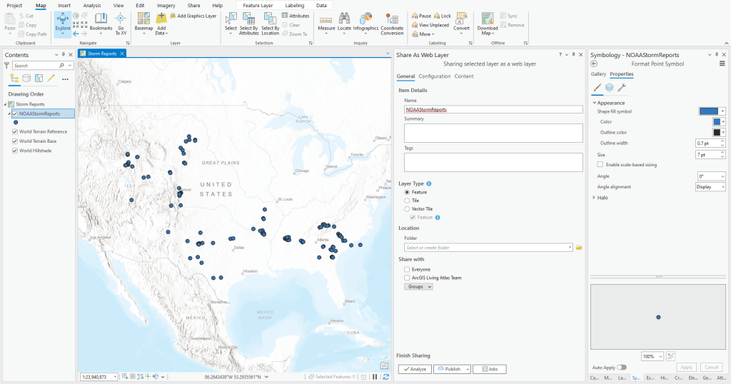
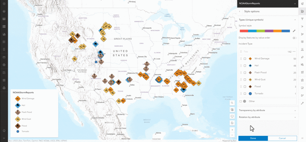
Custom symbols can enhance map readability but should be applied in ArcGIS Online, not during publishing. Use PNG or SVG symbols (max size 120×120 pixels) with transparent backgrounds. First, publish simple symbols from ArcGIS Pro, then replace them with custom ones in ArcGIS Online to maintain performance.
Tip 3: Create Custom Raster Color Palettes
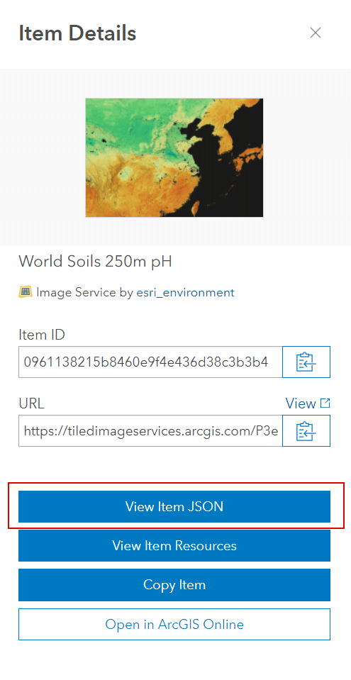
To use your custom color palettes from ArcGIS Pro in ArcGIS Online, modify the JSON file for the raster layer via ArcGIS Assistant. Edit the “fromColor” and “toColor” values with your RGB values to define smooth color transitions. Save your changes, and the new palette will appear in your layer. This trick works for stretched and classified rasters as well as features.
Tip 4: Quick Edits with the Vector Tile Style Editor
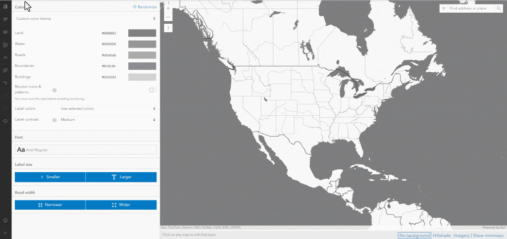
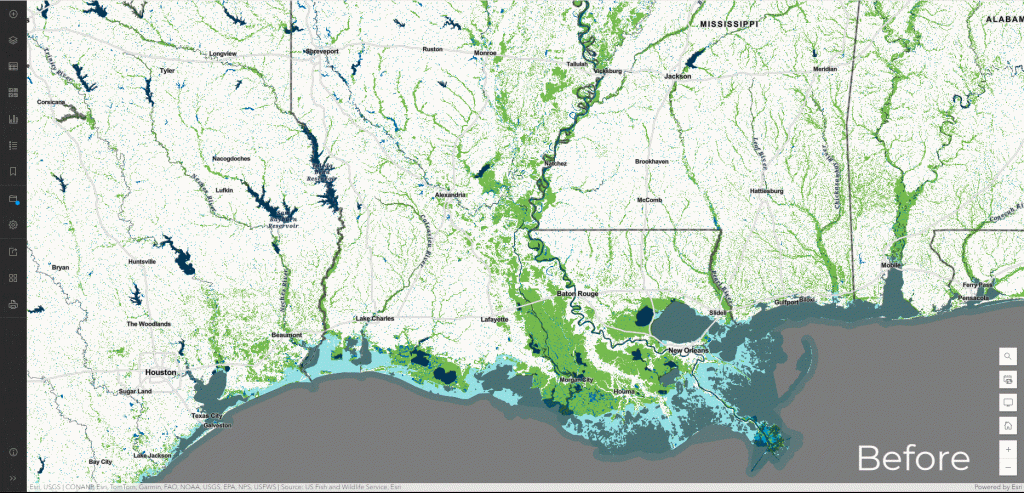
Customize Esri basemaps to better suit your maps. For example, adjust the Human Geography Detail basemap for a wetlands map by turning off unnecessary layers (e.g., buildings and roads) and tweaking water colors for better contrast. Save your edits and add the customized layer to your web map for a polished look.
Tip 5: Design Better Pop-Ups
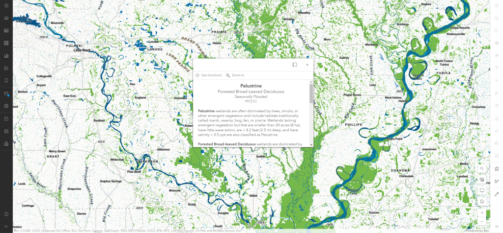
Avoid overwhelming users with unnecessary information like ShapeArea. Instead, configure Text pop-ups with relevant details, using field aliases to simplify terminology. For advanced designs, include images, charts, or graphs to provide meaningful context. Less clutter means faster map performance and a better user experience.
By applying these tips, you can create well-designed maps and layers that are clear, engaging, and informative.


