Discover What’s New in ArcGIS Dashboards (November 2024)
November 20, 2024 2024-11-20 12:30Discover What’s New in ArcGIS Dashboards (November 2024)
The November 2024 update to ArcGIS Dashboards brings exciting new features, enhancements, and performance improvements. Here’s a detailed look at the latest tools available for creating or editing dashboards in ArcGIS Online.
Related: What’s New in ArcGIS Maritime – November 2024
Font Options
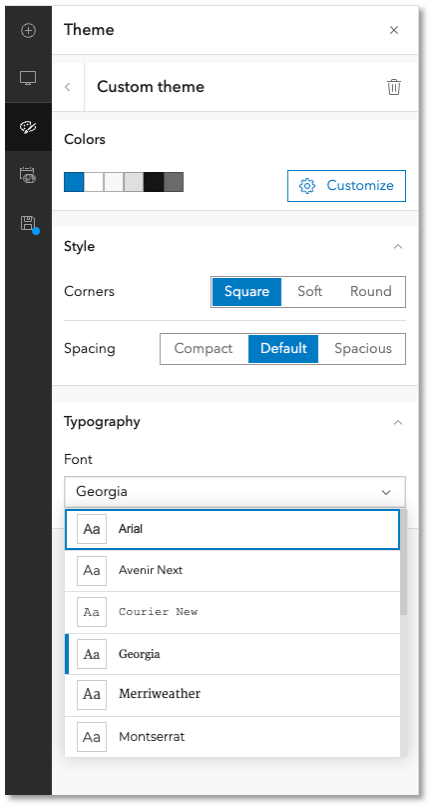
Dashboard authors can now select custom fonts to enhance the visual appeal and readability of their dashboards.
In the Custom Theme configuration, navigate to the Typography section to choose a font from the drop-down menu. Your selection will apply to dashboard areas like headings, titles, and labels, helping align your design with theme colors and spacing.
New Map Tools
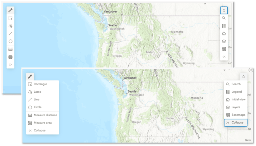
The update introduces a refreshed user experience and new measurement tools for maps.
- Simplified Design: Map tools now feature a compact, collapsible layout to maximize map visibility, especially useful for mobile and desktop views.
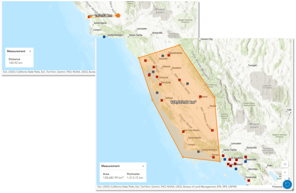
- Measurement Tools: A new Measure Tool allows users to calculate distances and areas in both 2D and 3D environments, providing precise spatial analysis for better decision-making.
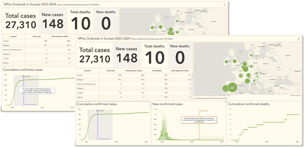
Date Axis Guides in Serial Charts
When using Parse Dates in Serial Charts, you can now add Date Axis Guides. These guides highlight a single date or a range of dates, offering additional context for data visualization.
Related: What’s New in ArcGIS Drone2Map 2024.2
3D Improvements
Dashboards now support map extent filters for web scenes. Changes to a web scene’s extent can dynamically filter dashboard elements or adjust the extent of other map components, enabling seamless integration between 3D and dashboard data.
Accessibility Enhancements
Esri continues to improve A11Y (Accessibility) features, such as better Screen Reader support and Keyboard Navigation, ensuring dashboards are accessible to a broader audience.
These updates enhance the usability and functionality of ArcGIS Dashboards, helping users create more visually appealing and context-rich dashboards.
This article was originally written by Martin Copping.

